.png)

Optimizing Asset
Management for
Target's 3D Artists
leading design direction for
an enterprise asset management app

WHO
Me (Product Design Intern)
UX Research Intern
Product Manager
Software Engineer
TIMEFRAME
10 weeks
June - August 2022
MY ROLE
UX Research, UX/UI Design,
Competitive Analysis, Design Reviews, Participatory Design, User Testing Mid-fi prototyping, Hi-fi prototyping, Design Presentations
PROBLEM & CONTEXT
Deep-diving into a 3D Artist’s Complex Workflow
Target’s 3D artists relied on multiple disconnected tools to find, filter, and manage assets. Artists across timexones were working in silos on assets and experienced frustration with tedious workflows. The result? Slow load times, scattered metadata, inconsistent filtering systems, and constant back-and-forth between Gallery Web, Gallery Desktop, and other Digital Content Creation apps.
As the Product Design Intern, I partnered with our UX Research Intern, engineer, PM, and global artists to simplify asset discovery and streamline workflows.
SOLUTION & OUTCOME
A Sneak Peek at the End Result & Impact

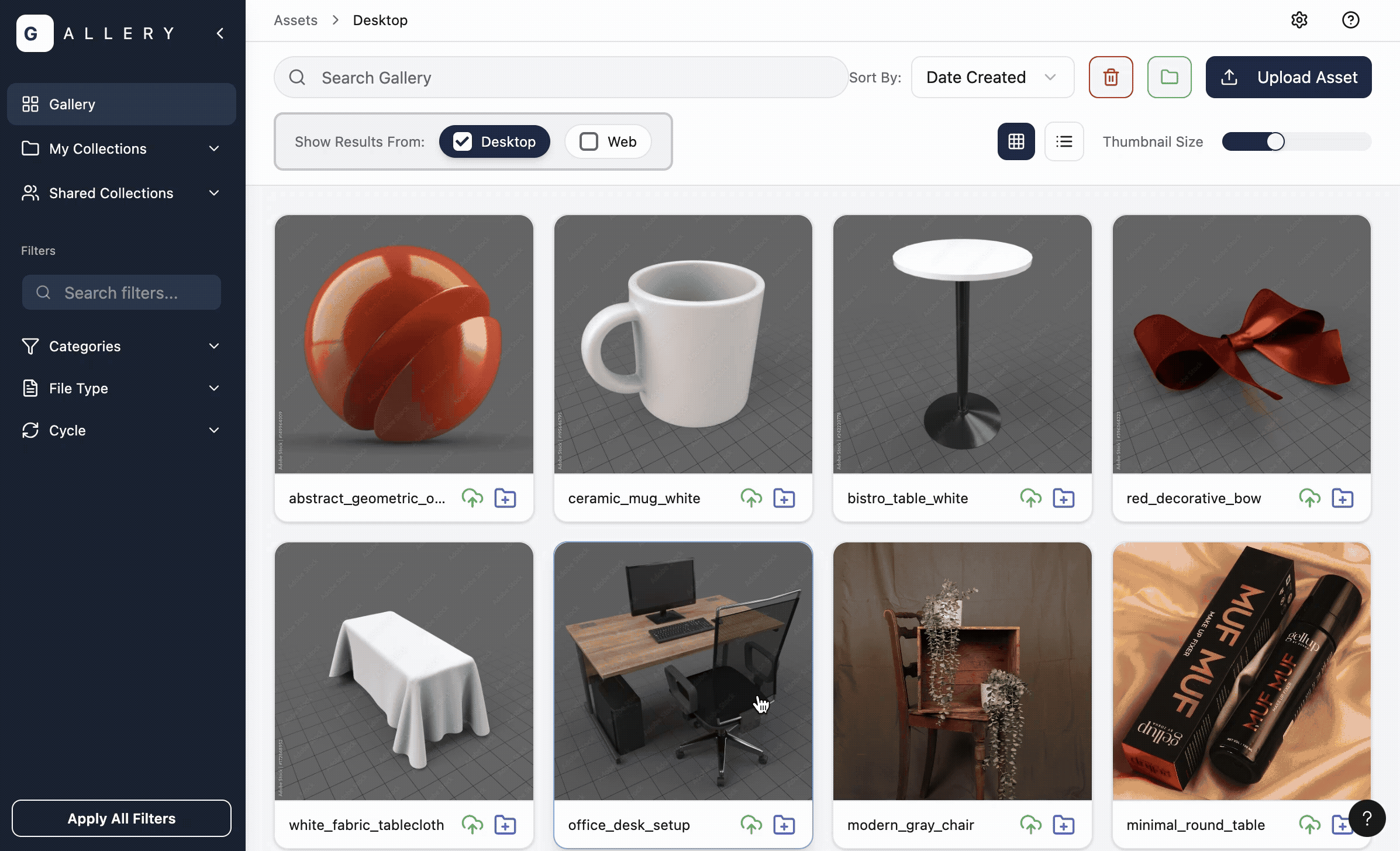
Original Gallery Desktop
Reduction in click-rate through Web-Desktop Integration
57%
.png)
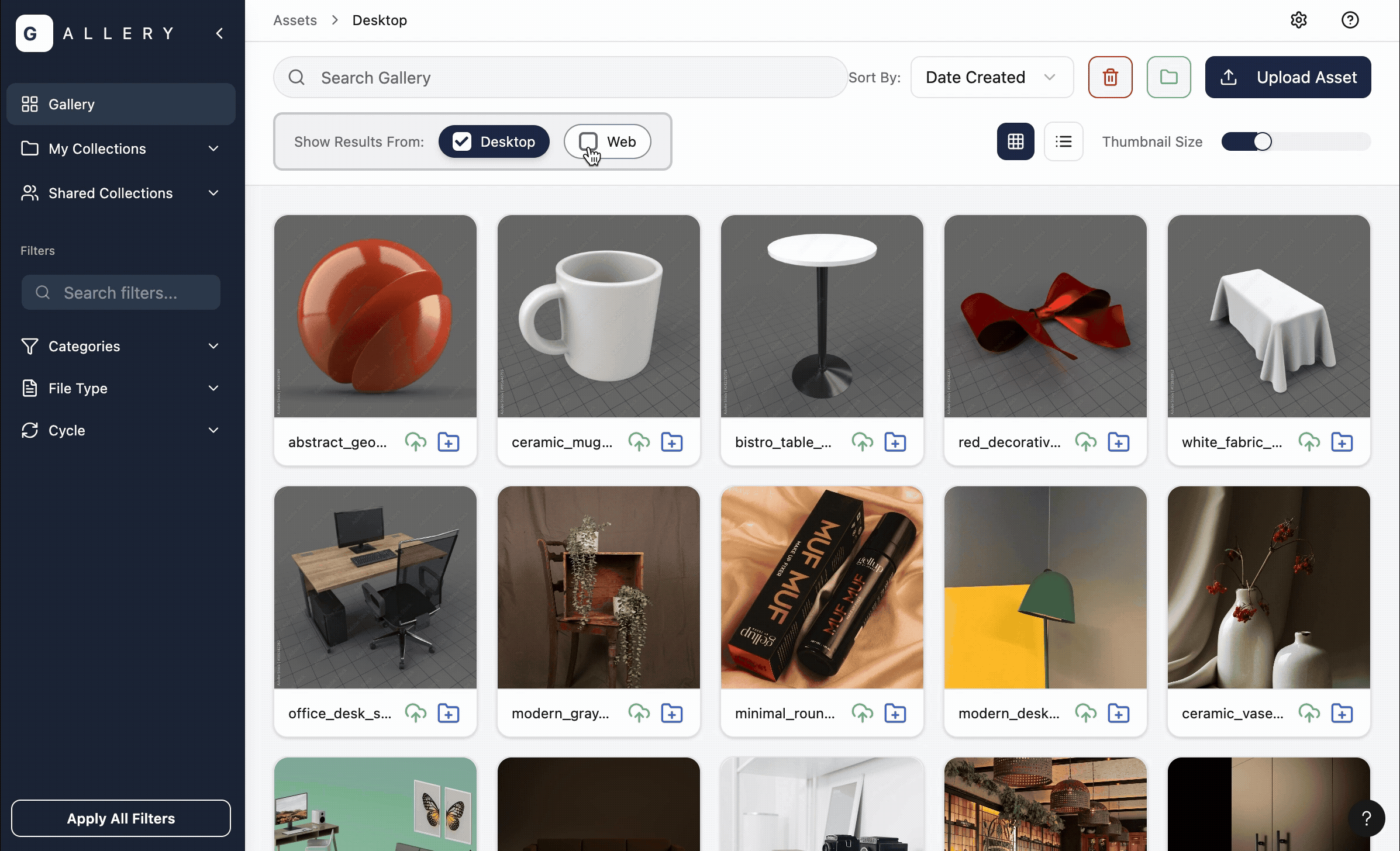
Redesigned Gallery Desktop
100%
Users preferred the redesigned Gallery Desktop to the original
DISCOVER
Problem Statement
3D artists rely on several filters and metadata details to do their work, but these are scattered across multiple tools. Switching between web and desktop breaks flow, slows asset search, and increases the risk of rework for Product, Marketing, and Supply Chain teams.
DISCOVER
Business Opportunity
Reducing workflow fragmentation could:
-
save significant production time
-
lower rework costs
-
and accelerate content delivery across teams.
KPIs: click-rates, time saved, user satisfaction
DISCOVER
Understanding a 3D Artist’s World
Before designing anything, I co-wrote and conducted cognitive walkthroughs and user testing. The reactions were honest:
"Sparks filters are so much easier to use. I don't really use Gallery's filters."
"It takes awhile for assets from the U.S. to load."
"I use both Gallery Desktop and Gallery Web because my sometimes I’ll collaborate with my teammates on certain assets. And I also use Blender to edit and put together the assets I’m working with."
- 3D Artists, Discovery Interviews

Typical applications a 3D artist uses.
Following our interviews, I conducted a competitive analysis to understand how different platforms were addressing the filter system.


Competitive analyses between Gallery Web, Spark, and Adobe Stock
Across interviews & a competitive analysis, Alex and I noticed three patterns:
1. App-switching = flow-killing
Artists searched for assets across 3+ tools.
2. Filters didn’t match mental models
Trusted (like Spark) used different terminology and hierarchy than Gallery
3. Missing or confusing metadata
TSINs, product IDs, and other micro-details weren’t surfaced consistently.
PRIORITIZATION AND IDEATION
Lots of Ideas, Not a lot of time
With dozens of feature requests floating around, we needed clarity.
I initiated a prioritization session with our PM, engineer, and UX Research Intern. Together, we evaluated:
-
feasibility
-
business value
-
user impact
-
existing technical constraints

We landed on these final priorities:
-
A filtering system that mirrors artists’ mental models
-
Built-in Web/Desktop integration
-
Clearer asset metadata architecture
DESIGN
Designing With, Not Just For (Co-Design Across Oceans)
A large portion of our artist team was based in India. Time zones made real-time design sessions difficult, so I created an asynchronous design system: a series of lightweight, interactive testing frames that artists could comment on in their own time.

We collected feedback from 7+ artists, which led to a few major insights:
-
Naming conventions and filtration categories
-
Visual scannability is of high priority
-
Version History
-
Thumbnail sizes
-
The Asynchronous Feedback form I designed on Miro! If you're curious, you can view the full form here.
This step reinforced something important: I couldn’t design this well without my users. I didn’t fully understand their complicated jargon & workflow; but they did and their design insights were invaluable.
ITERATION
Iterating for efficiency: a 57% click-rate reduction
Artists were constantly toggling between Gallery Web and Gallery Desktop. Inspired by Microsoft Word’s built-in stock image sidebar, I proposed a Gallery Desktop integration panel directly within Gallery Web.
Users loved it.
Design crit loved it.
And honestly, I loved it.
But our software engineer was not impressed. He said, "Why don't we just build the integration into the app?"
I hadn't even realized that was a possibility, so I quickly pivoted and re-iterated. I was grateful I'd checked in early with the engineering team.


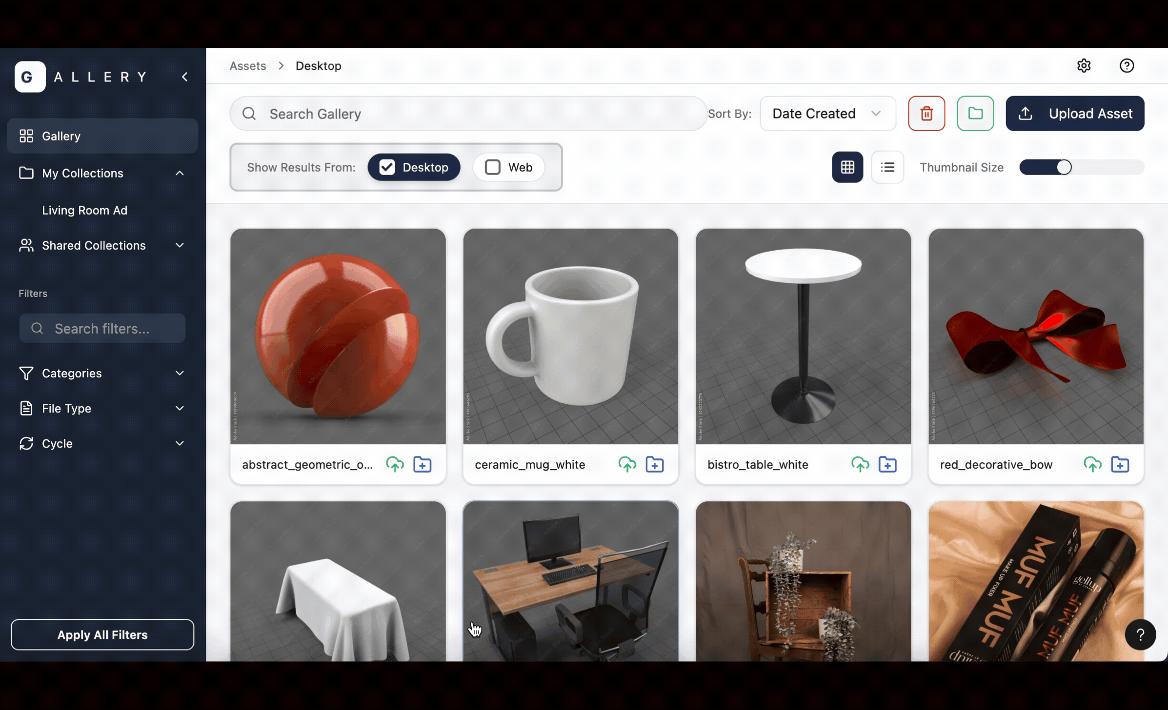
Original Desktop App
7 clicks

Mid-Fi Desktop App

5 clicks
.png)
Final Desktop App

3 clicks
ITERATION
That one user interview that changed everything
During our last interview, one of the users shared an input that changed the scope of what I’d imagined for the redesign.
“Honestly, it’s just a mess. They could go all together in this clean little folder, but I eventually give up. I create too many files too quickly and it becomes overwhelming to keep it all organized.”
- User Interviewee
.png)
An example of a 3D Artist's current organizational system
Oops; here was a massive organizational gap that we’d nearly missed.
With only a week left, I sketched out several ideas: built-in folders, metadata-driven auto-sorting concepts, etc.


I realized the issue wasn’t that users lacked a place to organize—it was that they lacked the time. Adding another folder or collection wouldn’t solve their core problem. What would help was shifting the work from the user to the system: let them upload their file, and let the system handle the sorting automatically.
The idea to utilize metadata for organization became the basis for Target’s new AI-assisted metadata feature, and it's now in active use.
IMPACT & FINAL SOLUTION
Landing With Confidence (100% User Satisfaction)
Prototype highlighting Web/Desktop Integration
Problem: Tool switching slowed artists down
Solution: Built-in web/desktop integration
57%
Click-Rate Reduction
Problem: Fragmented, frustrating organizations system
Solution: Metadata collection + auto-sorting
Feature in use at Target with AI-assisted deployment

Prototype highlighting organization feature.
Prototype highlighting the filtering system
Problem: Essential details scattered across apps
Solution: Centralized filtration info, easy copy/paste, version history
100%
User Preference
“This is a huge step forward. The categories, file type, and moving collections to dropdown really help with the puzzle of navigation.”
- 3D Artist


“I like the usability and design and a lot better. I’m excited about the unified workflow; it’s nice to not go back and forth between Web and Desktop.”
- 3D Artist
REFLECTION
Learnings

1. Get feedback from a variety of people while still in the lo-fi stage. Lo-fi work made it easy to invite users and long-time stakeholders in before anything was locked. Their different perspectives helped me catch blind spots early.
2. One strong insight can still be enough. A single comment from a 3D artist shifted the project. I didn’t have more interviews to confirm it, but I learned to trust the signal, build a quick test, and let validation happen later.
3. Prioritize clear KPIs from the start. I wish I had set a KPI for time saved. Clear success metrics early on make decisions easier and keep scope focused.