.png)
Revamping ChartNeo's UI and Driving User Retention
Revamping ChartNeo's UI and Driving User Retention
Revamping ChartNeo's UI and Driving User Retention

Revamping ChartNeo's UI and Driving User Retention
Spearheading user research and rebranding a FemTech app

WHO
UX Designer (me)
UX Researcher (also me)
Software Engineer
Doctor
Business Owner
MY ROLE
UX Research, UX/UI Design,
Competitive Analysis, User Testing
Mid-fi prototyping, Hi-fi prototyping,
Design Presentations
TIMEFRAME
13 week contract
CONTEXT
Understanding Cycle Charting Users & Stakeholders
ChartNeo is a HIPAA-compliant cycle charting app with roughly one thousand users who chart for three main goals: avoiding pregnancy, achieving pregnancy, or monitoring health. The product is maintained by a small three-person team, which limits the time available for UX research or design. I joined to help clarify the core problems, align the team, and redesign the charting experience to improve clarity, accuracy, and user confidence.
CONTEXT
Problem Statment
Users feel uncertain and frustrated when charting because terminology is confusing, essential steps are unclear, and the workflow allows them to skip important fields. They struggle to complete charts accurately and understand their progress, so they are consistently reaching out to practitioners for guidance. Users need a clear, guided, and supportive experience that helps them chart confidently and understand the impact of their entries.
DESIGN
A Sneak Peek at the Redesigned App + Results
.png)

75%
of users prefer the redesigned
to the original app
"
There’s a big difference between both the original app and the redesigned app. I really like how much information there is and the better use of screen space.
DISCOVER
Aligning the Team Around the Problem
My first task was unpacking the conflicting interpretations of the problem.

Users are skipping required fields and the people keep telling me the interface looks like it was designer by an engineer.
- Software Engineer

We're getting too many emails and calls with repetitive questions about charting basics.
- Business Owner

Users don't consistently fill out the information they need to, so it's hard to interpret their results. I think we need an onboarding video.
- Doctor
These perspectives described different symptoms of the same root issue:
Users did not understand what they were charting or how to chart accurately.
Bringing the team together around the problem statement created a shared foundation. Every later decision referred back to this single question: Does this help users chart with more clarity, accuracy, and confidence?
RESEARCH
Understanding the Clarity Gap
Users gave the app a
4/5 rating on ease-of-use
Users gave the app a
4/5 rating on visual appeal

Based on the survey results, it seemed like there were no glaring issues with the app, which contrasted with my competitive analysis insights and own personal biases. I went into user interviews confused and curious; I conducted 3 user interviews and uncovered the following insights.

Users love the app’s usability features, but prefer the visual design of other apps. 3/3 users mentioned that they enjoyed the usability of the current app, but 1/3 users mentioned that if Mira (another cycle charting app) had the same features ChartNeo did, she would switch.
The app needs improved educational onboarding features. 100% of users wished there were tool tips or a built in tutorial on how to use the app. A cycle charting practitioner who used the app with clients mentioned that she often had to set up meetings to walk clients through how to use the app, because they had trouble understanding the medical jargon and where to start.

These findings connected directly to the problem statement: Users could not chart confidently because the system did not explain itself.
RESEARCH
Using Competitor Research for Solution Ideation
My stakeholders expressed desire for a video tutorial, but I was hesitant because patients were already presented with introductory information from a cycle charting professional; the issue was that they kept forgetting. How would a video solve that problem?
I turned to other cycle charting apps to understand how the market addressed the problem of the gap in user understanding.

Mood board compiling charting + branding practices from other apps.

Competitor Analysis
Insights I uncovered were:
-
Competitors added value on the home screen through visual summaries, which helped users immediately understand their status.
-
Competitors relied on info icons rather than long onboarding videos, which matched users' need for quick, contextual clarification.
DESIGN STRATEGY
Bridging User Needs and Business Priorities
1. Clarify medical terms at the point of use.
Interviews and patient calls/emails revealed they were often confused by the meaning of the options on this screen.

A cycle charting screen on the original ChartNeo App.

2. Motivate users to complete critical fields.
Incomplete or skipped inputs resulted in inaccurate medical data and staff follow-up.
The initial data entry screen on the ChartNeo App.
3. Indicate progress to users.
Users needed immediate clarity on what tracking data was complete and what remained. Competitive analysis revealed progress indicators were a strong potential solution.


The Home and Cycle Charting screens on the original app. Both have no visual cues that indicate missing cycle days, etc.
IDEATION + CO-DESIGN
RITE Testing to Clarify Medical Terms
I had bi-weekly check-in’s with my team to update them on my progress and also to gain their insights on the app. One of the biggest issues I came across while user testing was that even experienced users often forgot the meaning of some terminology, and I recognized there was a need for more accessible definitions.
I worked with our doctor to create accurate & accessible definitions and completed 3 rounds of RITE highlighter testing with the new copy.
80%
Continued RITE testing until I reached at least 80% accuracy.

ITERATION
Automating the Question Flow to Increase Data Completion
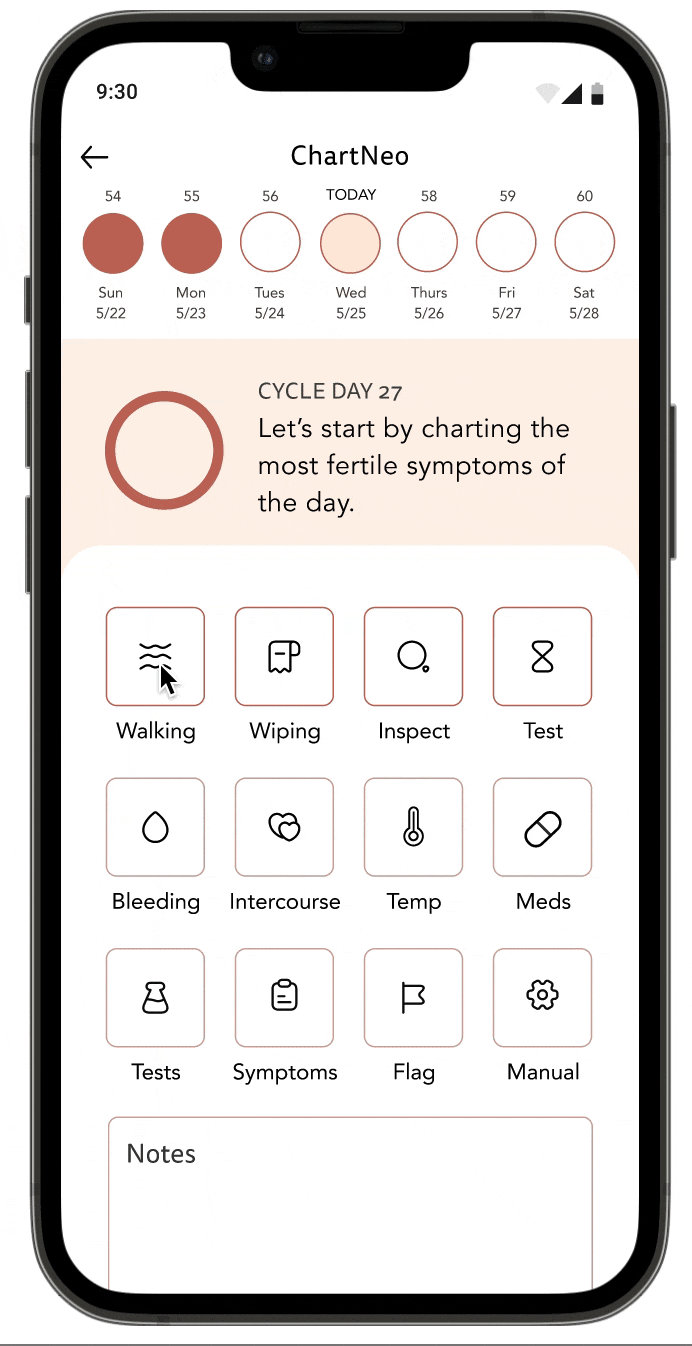
Since users could skip essential fields and did not know which ones mattered, skipped inputs resulted in inaccurate medical data and staff follow-up. I ideated with mid-fidelity mockups to help users understand which form fields were most essential to complete.


Medical/Business Goal:
Users should at least fill out the top 4 sections (Walking, Wiping, Inspect, and Test) to ensure accurate data for testing.
Some mockups to ideate visual cues that emphasize importance
Driving User Entry Completion ✅
50%
Decrease in click rate
The Original Entry Path required 8 clicks and back and forth between two screens
The Redesigned Entry Path requires only 4 clicks and no back and forth due to a new automated flow.
DESIGN
Optimizing Screens to Provide Value & Progress to users
One of my biggest challenges was integrating medical information in an accurate and visually informative format. The colors on the current app were dull and muted but matched with the medical model that medical practitioners were used to.
To compromise, I utilized a secondary color palette that matched up with the original colors while still maintaining the medical meaning of the current app.
Users lacked an immediate understanding of their tracking status.

Original App

Redesigned app
A progress circle on the homescreen that communicates charting consistency and reinforces correct behavior.
User specific data adds visual and informative value to home screen


Driving user understanding via visual cues: I paired each of the colors with the medical terminology helped educate users about their medical health through instance feedback.
EVALUATION
Navigating Team Alignment Through Data
Stakeholders had strong and sometimes conflicting opinions, and I wasn't a Subject Matter Expert in the field of cycle charting, so I was sometimes unsure about what would serve users and the business best. So, to ensure decisions stayed tied to the problem, I used A/B tests to validate direction.

Since users had rated the ChartNeo app pretty high in terms of the visual appeal, I needed user opinion on whether the redesign was actually helpful. 75 percent of survey respondents preferred Option A, which confirmed that the redesign was on the right track 😅

One of my stakeholders and I disagreed on the best way to visualize the calendar view top bar. I wanted to test a hypothesis about how to display data, and A/B testing proved my hypothesis was false. 80% of users preferred Option B, which helped the team and I redesign with confidence.
DESIGN
The Final Prototype + Results
TERMINOLOGY CLARITY
Problem: Increased customer service calls due to medical terminology confusion.
Solution: Information icons that underwent user testing for understandability.
Led to a decreased rate of customer service emails/calls based on stakeholder feedback

CHARTING ACCURACY
Problem: Users kept forgetting to enter data into the first four squares, which is most critical for charting accuracy.
Solution: Automatic question flow
50%
Click-rate reduction contributed to higher data entry rates.
USER MOTIVATION & CONSISTENCY
Problem: Users sometimes skipped charting days and forgot to consistently enter data.
Solution: Visual cues of completion states, and a more informative home screen.
75%
Preference for the redesign compared to the original app

REFLECTION
What I learned
-
Establish KPI's early and ask stakeholders to track them. I started out with KPI's I wanted to track, but it was retroactively difficult to ask stakeholders to go back and find data. If I could do this again, I'd definitely focus on stakeholder buy-in for tracking certain bits of data for greater measurements of success.
-
Always back reasoning with evidence. When stakeholders had conflicting opinions, bringing in data from RITE testing and A/B testing to make data-driven decisions helped drive solutions.
-
Start with mid-fidelity prototypes. Both my stakeholders and users would have strong opinions on color and visual design features, so establishing agreement on content and usability first was essential.